If you are looking for creative inspiration for your Instagram Page/Feed ideas, then this article is for you. Sharing trending Instagram page designs, that are enough to get artistic design ideas for your page.
It is said that over 80% of Instagram users follow at least one business account. Over the years, Instagram has grown into a business-like social media platform. A lot of its users have readily embraced buying a product on Instagram against buying a product through other platforms. Not only this, but Instagram users have also taken to discovering new places to travel to through Instagram page idea. Before, if someone wanted to travel and was looking for inspiration on where to visit, google was the go-to app for that.
But things have changed for the better. One would ask, why are people switching from google to Instagram when searching for places to visit? Isn’t google more versatile? Here is the reason why people are turning from google to Instagram when they are looking for travel inspirations.
Unlike Google, whose pictures of a particular product, resort, or travel location is from the owner of the business, on Instagram, one can find a picture of a product or travel location from a customer’s view. While the owner of a product or travel location may filter, edit, and beautify the images of his products, people patronizing a business usually take snapshots of the product or travel location as it is in real-time. No filters, no editing, they have nothing to lose.
It is, therefore, safe to say that people have turned to Instagram for business because not only do they trust the social media platform itself. But they also trust the influencers and other Instagram users to point them in the right direction, business-wise. Having said this, a business owner must make out time to plan and develop the Trending Instagram page design idea.
One could liken an Instagram page to a business website. You know how you carefully planned out your business website, knowing fully well that it is one of the ways to make a good impression on your customer, well you should also carefully plan your Instagram page like that. Take your Instagram feed design as your social media website. Have a look at some trending Instagram page designs and learn from that.
Does it sound like a difficult thing to do? If yes, then I have good news for you. You don’t have to make your Instagram feed look beautiful by yourself. You can simply employ a good social media marketing service, but try to avoid services that use bots.
The best option is the Instagram growth service mother-child method that will work perfectly, use it and you’ll see how your targeted audience grows. Keep in mind that your Instagram page design should contain all the necessary details your customers need to know about you. Including a summary of what you or your company is all about.
In summary, your instagram feed ideas should be designed to be able to convert followers and visitors into buyers and vice versa. While Instagram only permits the use of words to describe one’s business on Instagram. There is also a feature that allows business owners to showcase the picture of their owners to visitors and followers.
The Instagram story highlights is an Instagram business feature where business owners can highlight and post pictures of their products for their visitors and their followers. Unlike Instagram stories that last for only twenty-four hours before disappearing, Instagram stories stay permanently on Instagram’s business accounts.
Another important reason why the beauty, originality, and uniqueness of your Instagram page theme is essential is that it will attract visitors, followers, and customers for you.
Related: Trending Instagram Hashtags to Boost Engagement
Does an Instagram page designs increase the number of IG followers or subscribers?
Trending Instagram page designs, are a hot topic. One of the primary reasons why your Instagram feed design should be top-notch is because it serves as a magnet to followers or subscribers. This is how it does it. An Instagram feed design with a consistent theme color is more likely to convert visitors and followers than an uncoordinated Instagram page.
Most of the successful brands on Instagram have attested to the increased user engagement because of their fine-tuned Instagram feed ideas. Most of these brands use one particular color, design pattern, one filter. Or even one specific editing process, to make their Instagram page design, a trending one. This consistent use of a particular color or editing process. That will help their followers to be able to spot their brand at first glance.
This is not to say that all the posts in your Instagram account should be the same, no, for instance, if your brand’s color is yellow and green. You should do everything possible to add the littlest yellow and green color in every one of your posts.
When a visitor visits your page, he or she get a promotion to follow you, to at least get a first-hand view of your engaging content.
On the other hand, an uncoordinated and unengaging Instagram page may negatively influence the number of visitors that click to follow your account.
Related: Trending Instagram “Ask Me Anything” Questions
Three IG accounts with Trending Instagram Page Designs.
- Daniel Rueda @drcuerda: is a photographer and a content creator from Valencia. His Instagram posts usually consist of a person (himself and his partner, Anna Devis) and a wall. His designs are so original and intriguing that you would have no options than to scroll down to see all his previous designs. Engaging Instagram feed made me hit the follow button. Just to have his beautiful designs to grace my Instagram feed ideas. Do you now see the power of a good Instagram feed design, it intrigues and captures the attention of visitors, who will, in turn, follow the account, to get a regular update of the account.
- Linda Yoshida @lindayoshida: Linda is a Californian calligrapher. Her trending Instagram page design is basically filed with pictures of write-ups in her beautiful calligraphic hands. Linda became famous during her daily upload of quotes from the game of thrones before its season premiere in 2015. Her best quote post is her “kill the crows” post. She wrote, “kill the crows” with beautiful calligraphy in golden and brown color. She also drew three crows and a crow-quill nib. Her caption reads, “Tonight, we’ll fight.”
- Biafra Inc @biafrainc: Biafra is an anonymous street artist based in Minneapolis. He creates his contents using paint spray and other implements. Most of his paintings are said to be a reflection of his life. I didn’t believe this until I went to his page and stumbled into one of his posts. This painting was of a pretty lady with what looked like a door where her brain was supposed to be. This painting depicts that the mind of a human is like a house full of different corridors and chambers.
Related: Trending Instagram Challenges You Should Try Right Now
Do you know about UI Designs?
User interface designs commonly known as UI design is basically a designing process in which a designer creates interfaces in software that focuses on looks and style that means how it will look.
Talking about Instagram here are some popular UI trends that you can follow-
1. Curved edges
A curved edges or rounded edges look good and classy look to your insta wall and gives your users and better scroll experience.
2. Animation
Animated creatives and videos remained one of the top trends in 2020. They bring lots of creative ideas, various business pages, adapted animated videos, gifs to bring crowds and make their Instagram more attractive. This comes with more trending Instagram page designs to amaze your audience.
3. Grid

Grids on Instagram remained a favorite for many weather fashion influencers for brands. It is basically the overall layout of how your insta look trendy. Or what idea you follow when a person opens your Instagram wall.
4. White and black border

The white and black border is a simple and elegant style to keep your account updated and theme based. You just need to put a basic white or black border on pictures you post do, and you are done!

5. Lines

Line theme designs look very classy and different. It can be horizontal, diagonal, or vertical. In lines take a bit of planning while you post pictures. Pictures with a similar identity should be uploaded. Posting quotes on a white background or on different colors in the same pattern that creates lines on your Instagram scroll.
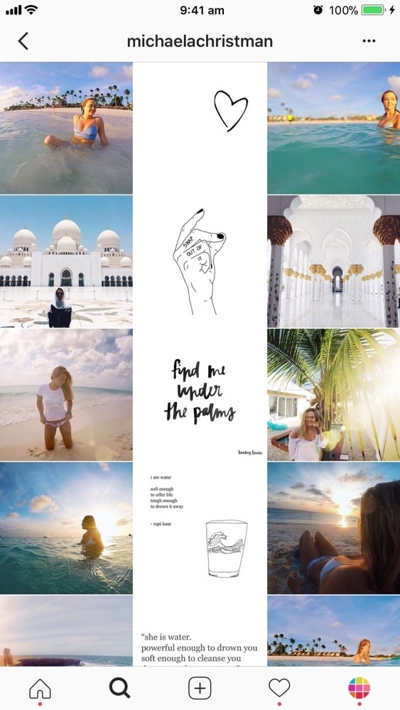
6. Tiles (Most Trending Instagram Design)

To make your Instagram profile more interesting and different for your viewers. To maintain the title theme, you need to post every alternate post similar, just it can be some quote or similar graphic orientated.
7. Rainbow
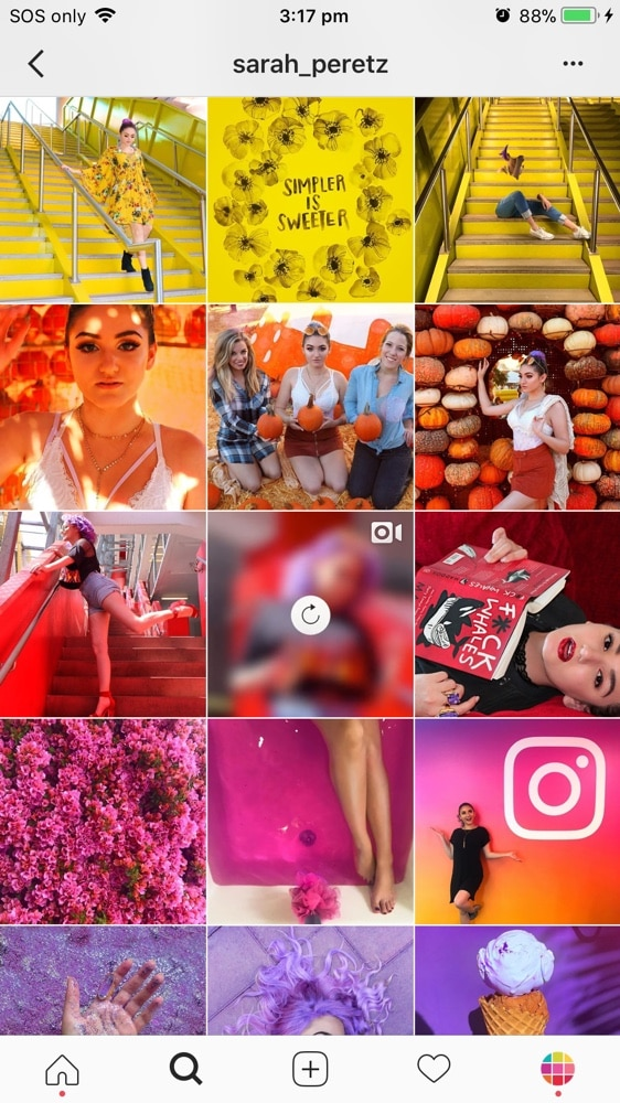
The rainbow theme is very different and hard to maintain. But if you really try your account would surely stand out. In the rainbow theme, every row belongs to a single color and with every row color change and give your scroll a rainbow appearance.
8. The Rectangle theme

The rectangle theme is another simple and easy to maintain and look. For a rectangle theme, you need to be in a horizontal angle and add a horizontal line on the top bottom of every picture of a single color.
9. Black and white

The name of the theme says it all. In black and white theme make sure all the pictures that you post need to be black and white.
10. Same filter

In the same filter theme is classy and very simple to maintain. All the pictures that you post need to be in a single filter, this helps in giving a similar look while you are posting very different pictures.
11. Solid colors
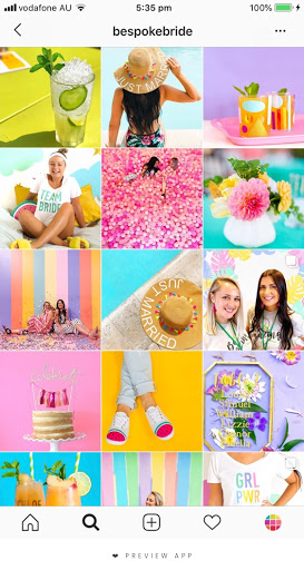
Whether in fashion or on social media, the world is going crazy over solid colors. Keeping your Instagram with a solid color theme can be quite hectic but will look very trendy for sure. Every picture you take to post make sure it has some solid color either subject or the background.
12. Colour coordinated

Colour co-ordinated themes can be very interesting and depends on how you maintain them. Choose the maximum of three colors, and all the pictures you will post will be based on those colors and your scroll will look theme.
13. White background

White background theme is very subtle and looks beautiful on Instagram. Every picture that you post should have white background. Maintaining this theme is quite hard but can be very interesting to try!
Making a good UI isn’t a hard or very professional task usually companies hire graphic designers but you need not to do so. There are various apps available you can use to make your Instagram feed better. Apps like Canva, freepik are some popular and easy to use so download the create them and you are good to go!
What’s Your Favourite Instagram Design?
In conclusion, having an Trending Instagram feed has more advantages and little or no disadvantages. Remember, you don’t have to do it yourself, you can employ one of the best Instagram growth service providers to help you achieve that. One of the best is SimplyGram. Or, you can also look at the Instagram feed ideas of the above accounts and get inspiration for yours.
Have some creative thoughts over trending Instagram page designs? Then let us know, in the comment section below.


