PowerPoint Presentation is a backbone when you present your work at the office, college or any profession podium. It keeps the audience engaged in your content. But if you make a messy and puerile PPT you may lose your charm even if you are an eloquent speaker.
So it becomes very important for you to make it professional and presentable. So here I give you the five tips to make your PPT professional.
1. Avoid Making it Over Decorative

PowerPoint is used by everyone for different purposes. But when you are making a professional PPT, it becomes important for you to make it tidy. So, first of all, select a decent and single or two shaded background design. Also, try to avoid using the animations available in the software. Along with that if you are using transitions, let it be as simple as possible.
2. Have Consistency Throughout the Slides

Consistency is necessary for success in any task. Same is here in PPT, you should be consistent in the designs, background, colors, fonts, sizes, etc. throughout the presentation. All the titles should be of the same size, the content should be smaller than the titles and everything should be typed in the same font. So that when the slide is changed, it does not feel like you are entering a different world every time.
3. Make use of Smart Arts

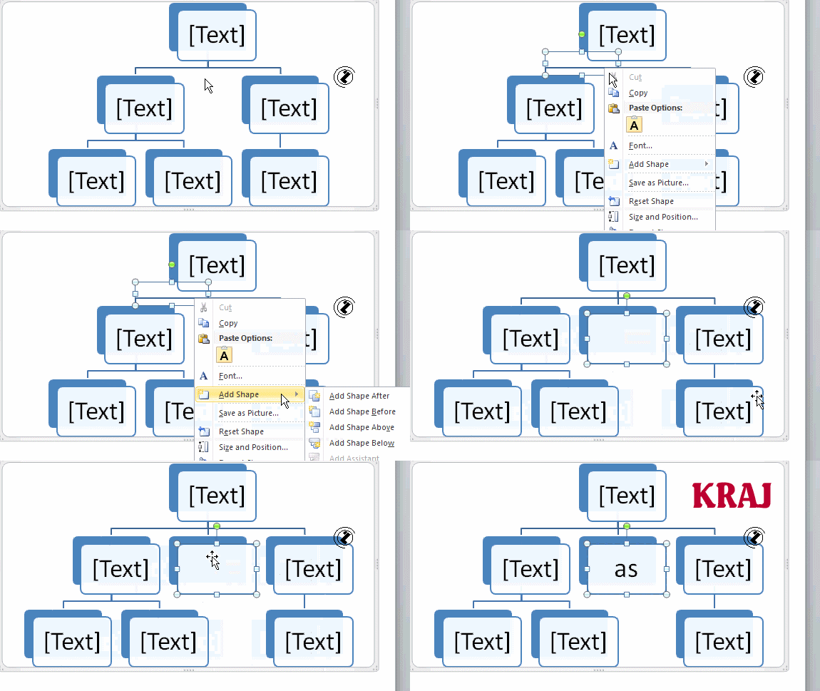
Smart Arts in PowerPoint is the most interactive tool to use. PowerPoint has various types of Smart Art for different content. May it be a list, process, hierarchy, cycle, relationship etc., Smart Art has it all. It tries to make understanding easy. It is available in INSERT MENU. Smart Art will help to keep the audience engaged. Next to Smart Art, we have shapes which will help to make it more appealing.
4. Get the Benefits of the Shapes of the Powerpoint
Most people don’t know how versatile PowerPoint shape tools have become. In addition to the extended format options launched by Microsoft in 2010, the ability for good shape design is easily available. PowerPoint gives users a vast number of great shape options beyond the traditional rectangle, oval, and rounded rectangle patterns, unlike professional design programs like Adobe Creative Suite.
Today’s shapes include a high functioning Smart Shapes feature that allows you to create diagrams and flowcharts in no time. Such tools are especially valuable when you remember that PowerPoint is a visual medium. Paragraphing and bullet lists are uninteresting— you can use shapes to help you convey your idea more precisely.
5. Show Less, Speak More!
When you present to make sure that everything is not written down in the PPT. Because if that is so, someone can read it, you are not needed. So see that you are just writing the head points of the content and speak in more detail about it. If you think you will forget, you can write below in the notes of PPT or you can carry flashcards for your reference. This would make the audience think that you are a cogent speaker.
6. Charts and Tables Are Cherry on the Top
If your topic allows you to use any charts or Tables do that without any hesitation. It can make the PPT look more attractive and still it does not lose the essence, But make sure the charts are related to the topic. When you have some calculations or some statistical data, make use of tables, this will make your data visible properly and understandable.
Follow these steps and make an admiring presentation and you would for sure stand out of the crowd. Even when you are working at someplace either as an intern or full-time job you need to follow these tips, so take a good look at them and implement them as soon as possible.
7. Make Sure You Keep Your Audience in Mind
You are supposed to make your PowerPoint presentation keeping in mind the following questions :
– What does my audience know?
– What do I need to inform them about this?
– What are they expecting?
– What’s going to be interesting to them?
– What can I ask them to do?
– What’s going to keep them concentrated?
Respond to these queries and simplify the slides down to the essentials. In your presentation, explain the basics in a fun manner and use your arms, i.e. language, photographs, and animations carefully.
8. Be Confident While Delivering Your Presentation
An energized speech can help you keep your audience concentrated for a long time. Here are some key points that characterize a good conversation:
– learn your slides inside out.
– Talk freely
– Speak confidently and be loud as well as clear
– Maintain eye contact with the audience
Check something related: – 7 Reasons to Intern at a Start-Up
Also, Check out this Amazing video.
9. Collect all the Content in a Word File

To make your presentation look professional and better it is just not the outer décor or graphs but also the content of your presentation. Collect all the content and research work prior and compile it in a word file topic-wise. This will help you in making a precise and on-point presentation. It makes your work quite easy as well, instead of copy-pasting direct from the internet a well frame and on-point content looks more professional, with no lengthy para pasting or non-matching points in the same slides.
10. Highlight One Point Per Slide
While preparing your presentation put emphasis on one point at a time don’t, avoid content stuffing in slides. This helps in putting your view more clearly, this will help you in conveying your point to your audience and they will get time to absorb the same.
11. Add Proper Images to Create Impact

Images are not compulsory but quite necessary, image adds more impact to a presentation and makes it more interesting. But make sure there should be consistency and proper placement in your images, the arrangement should be proper with breathable space on the edges.
12. An Eye on Small Details
Small details are very essential, especially on a professional level like the arrangement of charts, image placements, content, font, etc. You can also add hyperlinks and videos for a better look this will indicate well-researched content. Details like the color of graphs and charts on every slide should be consistent.


GIFs are good and actually make the blog light and connect more.
A very stereotype topic still very well written. Nice work keep it up.
Very much helpful!